
Outlook on the
Mobile Web
DESIGN FOR PWA & MOBILE WEB · USER TESTING · RESEARCH
Early 2020, we shipped a brand new experience for Microsoft Outlook on the mobile web which is now used by over 65 million people a month. This involved a revamp of the inbox, calendar, people and search experiences while addressing the unique nuances of designing for PWAs and mobile web.
INTRODUCTION
MY ROLE
THE TEAM
TIMELINE
Responsible for research, conceptualisation, design, user testing and delivery of key modules and feature areas.
4 designers, 3 product managers and 15+ engineers.
March 2019— Jan 2020

Case studies of my focus areas during the redesign
CLICK ONE TO KNOW MORE

Designing for the road bumps
ERROR HANDLING FRAMEWORK

The curious case of illegible text
TYPOGRAPHY for mobile web

Bringing people experiences to Outlook mobile web
PEOPLE MODULE AND PEOPLE CARDS

A helpful, more intuitive way to search in Outlook mobile web
UNIFIED SEARCH
A helpful, more intuitive way to search in Outlook mobile web
Search in Outlook mobile web was a rudimentary and disjointed experience. Typing on phones is hard, and our old search made users do all the work. How might we make search faster, unified yet contextual so people can easily find what they're looking for.
PROBLEM STATEMENT
🤳🏾 Users get no help at any stage of search
📅 No event and calendar search
🔍 Can search for only one type of entity at a time
Typing on phones is hard, and with no aid to accelerate the process of search, users had to type entire queries and scan through a long, flat list of results.
Users may need to look at results across mail, calendar and people and accessing different types of results should be seamless. Our search was not global and unified.
BREAKDOWN OF THE PROBLEM
Our old experience didn't have support for event search. We needed to make search was truly unified so users can access all the types of results.


Understanding how, what and when people search on Outlook mobile.
Speaking to Outlook mobile users on their search habits was super insightful and helped us take key decisions for our experiences. Here are a few main takeaways.
⚖️ Balance between contextual and unified search.
🙅 Irrelevant content in zero query go unnoticed and is mostly tuned out.
🗃 Inbox is like a vault. People look for a lot of attachments, files and emails.
🕵️ A person's name is a common pivot while searching.

Your most important people in search zero query
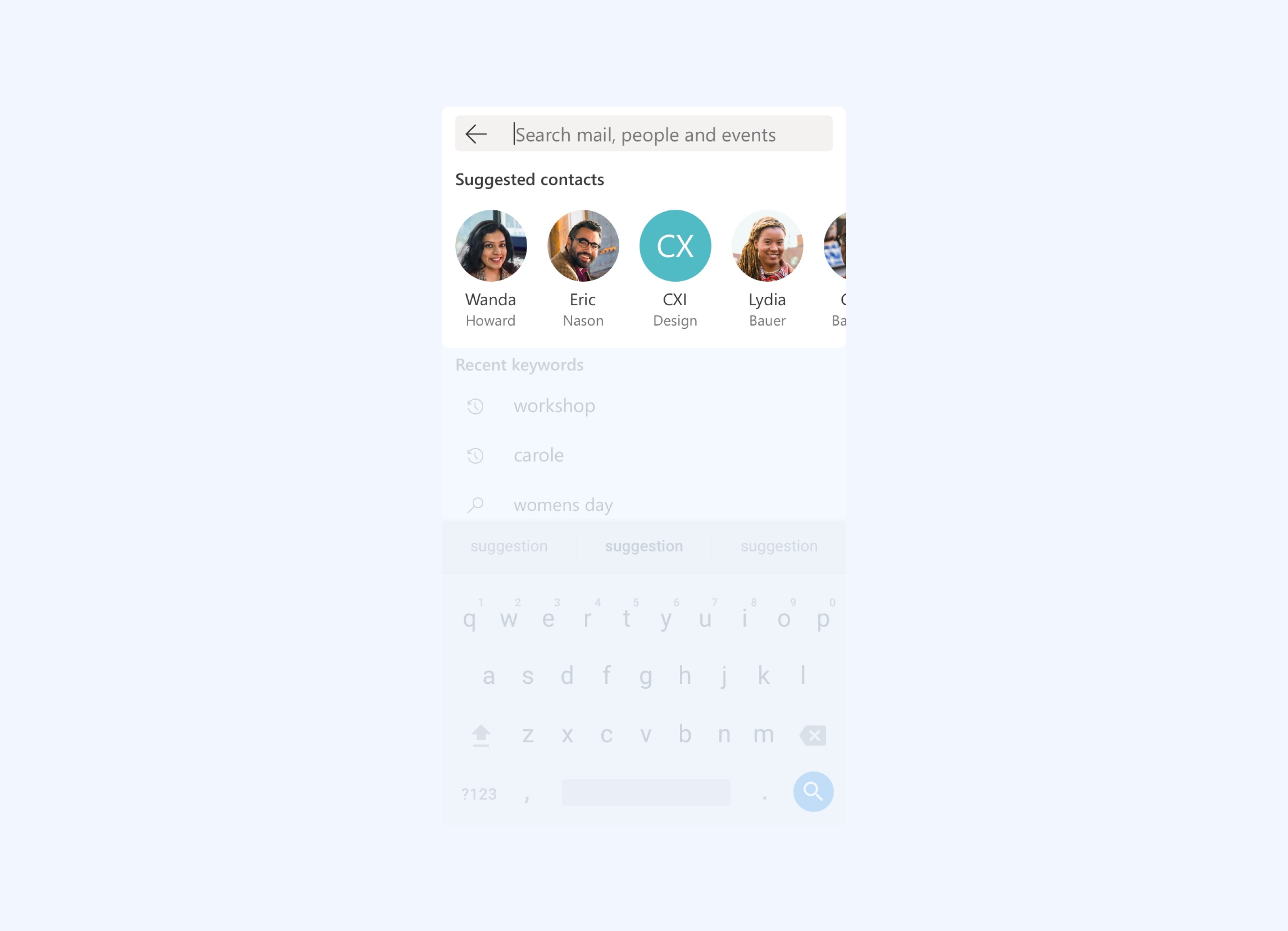
We know from research (keyword data, user interviews, research reports) that users very often use people as a pivot to search for things (eg: mails).
ZERO QUERY
This guided our decision to have a carousel of the people you interact with most at the top of our zero query content.
ZERO QUERY
Deciding on number of recent keywords

Mobile web poses unique challenges in terms of available real estate. We took the decision the keypad being up by default, so that users start search right away.
With the keypad up, we wanted to keep keywords limited to what fits in the available space without getting hidden behind the keypad. This is responsive to device size.
TYPE AHEAD
Suggestions while typing the query

While typing, we wanted the suggestions to help accelerate the process of search so that users can search faster without typing a lot.
The suggestions are a mix of recent keywords, suggested keywords that are trending in your network and people.
SEARCH RESULTS
Contextual yet unified results

A key decision we took for search results was that the user will always land on the result category matching the module they started search from. However they can easily switch across different result types.
For example, if search is invoked from the mail module, the user lands on mail results. This keeps the SERP contextual yet unified.
SEARCH RESULTS
Folder scoping in mail results

We've observed and heard from our users that they often look within email folders to scope down the number of results they need to go through.
Which is why the email search results gives the user the control to look within specific folders.
SEARCH RESULTS
People and event results

The people results are a simple list of matching people results.
Calendar search results follow a time axis, with landing focus on the nearest upcoming event result. Scrolling up takes the user back in time, and scrolling down takes the users to the future. Sticky month+year headers help anchor the point in time. Past events dates are a lighter grey to distinguish them from upcoming events.
ZERO QUERY / FUTURE SCOPE
Contextual and intelligent zero query going forward
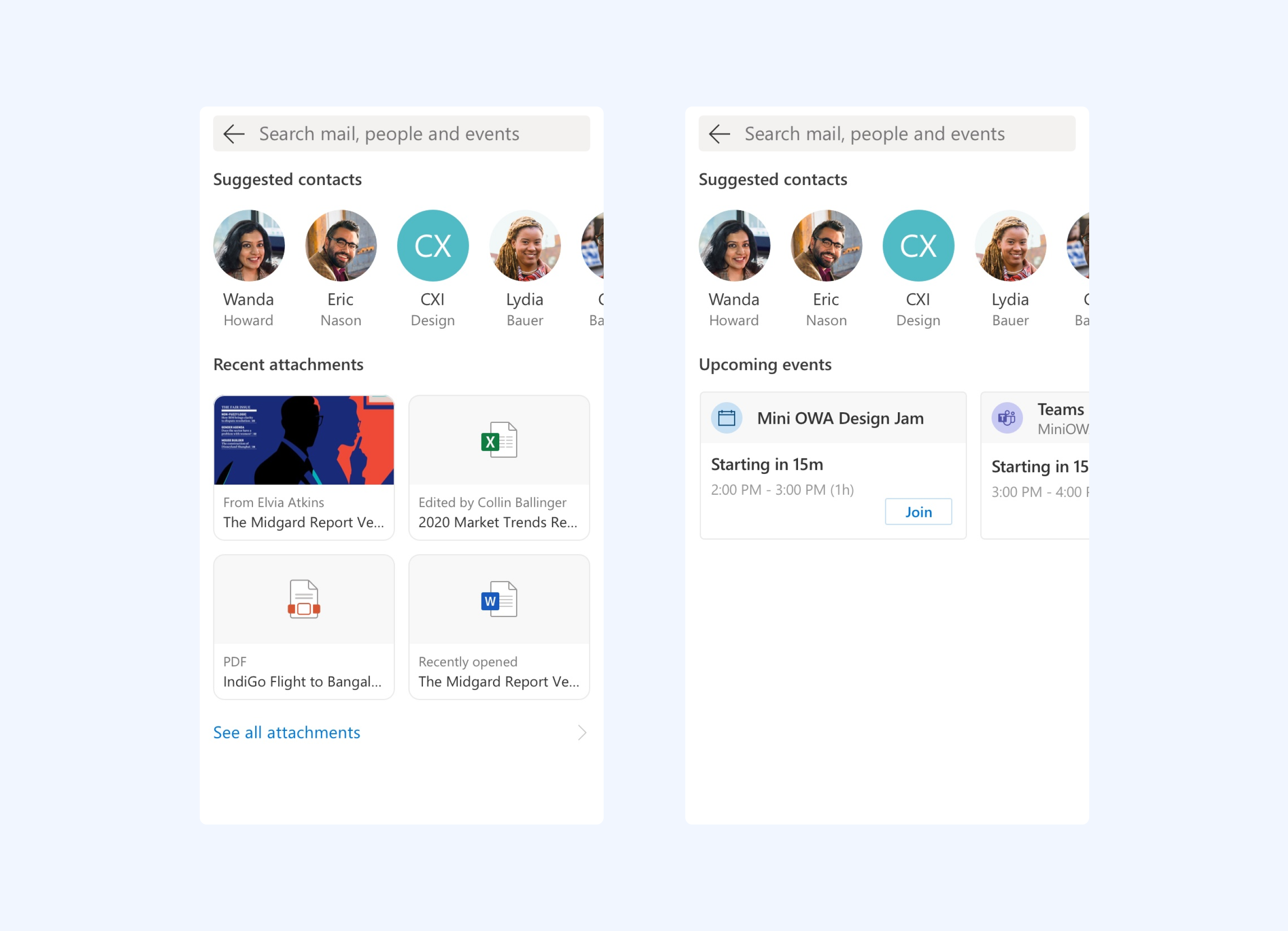
We also brainstormed on ways to make zero query more contextual and helpful. We know from our users that they look for a lot of attachments. Hence, when invoked from mail module, zero query can have attachments as content.
Similarly when invoked from calendar, zero query can show upcoming events with option to take action as well.
Validating and shipping the new Search
Once the new experience was ready, we reached out to Outlook mobile users for Flash Feedback sessions. We asked them to try out the new experience, and to our extreme delight all users were able to intuitively start and complete their searches, understand and use the new features and had almost no hiccups along the way.


Some verbatim feedback:
"clean and modern"
"no hindrance to search"
"I'm able to find what I need"
"contact and keyword suggestions are helpful
"clean and modern"
"no hindrance to search"
"I'm able to find what I need"
"contact and keyword suggestions are helpful
Designing for the road bumps: Error handling framework for mobile web
A key challenge with mobile web is that it is network dependent. Aside from the ideal state (online) there's a range of states users might end up in where network is patchy, content is loading or things fail. How might we reduce user anxieties during moments of failure and give them a clear way ahead?
PROBLEM STATEMENT


Error types from the framework
GUIDELINE DOCUMENT FOR EACH ERROR COMPONENT
Blanket screen errors

Blanket screen errors are used when the entire content of the page fails to load. To not make it a dead end, users have a clear CTA to 'Retry' loading the page. The illustrations and copy is light hearted to reduce user anxiety.
Error TYPES
ERROR TYPES
Inline infobars

Inline infobars are used in any kind of compose experiences where the user is typed or edited something and there is unsaved data due to an error. This ensures that whatever the user has composed is retained and they can get back to it as soon as the error is resolved.
error types
Errors in a scrolling list

This error type is unique to mobile web. To keep the app performant and fast, long infinite lists are loaded in batches. When the user is scrolling very fast, the content might take time to load and can sometimes fail as well.
To fix this, we introduced skeleton UI to show that the list is loading, and on failure there's a clear CTA for users to refresh.
ERROR TYPES
Toast errors

Toast errors are used when a user takes an action and the action fails to get completed. Toast come in as a layer on top of the existing screen so that the context is retained and the user can reattempt the action easily.
The curious case of illegible text
After shipping the new experience, we started getting a lot of user feedback about people not being able to read text comfortably in the app. We had to quickly investigate and get to the root of the problem in order to fix the issue. This taught us about the unique nuances of designing and implementing typography in mobile web.
BACKGROUND
High and low DPI devices render type differently in web

We found that despite implementing a legible type ramp, mobile browsers render font sizes differently across devices. This is due to the DPI (dots per inch)of phone displays. Low end phones have a lower DPI causing browsers to render type in a larger size. While high end phone (eg: iPhones) render type smaller than normal.
PROBLEM 1
Hence what we see in our design files is different from what actually got rendered in the mobile browser.
PROBLEM 2
Smallest font size used was hard to read

We followed an even type ramp of 12px-14px-16px and so on. Due to this the smallest font size, 12px was actually quite small and difficult to read in a bunch of screens across the app.
PROCESS
Squint testing and correcting fonts sizes on paper

To fix the type ramp we started by printing out all our screens, and dig into wherever we observed reading feeling uncomfortable.
PROCESS
Working directly in code with developers and dev tools

To see our proposed changes live and in action, we worked directly with our developers in dev tools to collaborate on type ramp changes directly in the build.

The new revised type ramp
Our final recommendation was optimised to read well in both high DPI and low DPI devices. Our proposal bumped up the type ramp by 1px across to 13px-15px-17px and so on, while also revising padding & margins across the app to bring in more breathing space. The new type ramp was much more comfortable to read on all phones.
Bringing people experiences to Outlook mobile web
The people module is one of the three main modules in Outlook mobile web. As part of the redesign, I was responsible for bringing the people module, the people cards and its connected experiences to the app. The new people experiences saw a 300% increase in usage from 4M to 13M after release.
BACKGROUND

People cards

People cards are used across the Microsoft ecosystem as a profile of a person. It can be invoked from anywhere the person's name and avatar appear. It gives information about the person's role, contact details, network and more.
HIGHLIGHTS
As people cards appear across Microsoft products, it was key for us to follow the design paradigms of existing people cards to make the experience consistent.
HIGHLIGHTS
Know your organisation and network

An important and highly used feature of the people card is the organisation chart that helps you understand anyone's network and reporting structure better.
Group cards

Along with people cards, which are profiles of a single person, we also built group cards and distribution list cards. These are profile of a group of people and accordingly has details about the group such as number of members, security settings etc.
HIGHLIGHTS
Highlights
Creating new contacts

We also built the CUD (create, update, delete) operations for a contact. These flows allows users to add contacts to their list, create new ones and edit and delete existing ones.